KROMA: How we turned the online storefront into the main sales channel
-
Client
KROMA
-
Services
Web development, UX/UI
-
Link
kroma.com
-
42
Implementation period (days)
-

platform
-
x3
additional parameter
Task: From aesthetics to effectiveness
KROMA is a brand with an excellent product and a strong philosophy of minimalism. Their previous website was visually appealing but did not fulfill the main business objective — it didn’t drive sales.
Key issues the client brought to us:
• Low conversion: Users admired the photos but rarely proceeded to purchase.
• Complicated user journey: Confusing navigation and a non-intuitive checkout process caused customers to leave the site.
• High bounce rate: More than half of visitors left the site after viewing just the first page.
Our task was not just to "redesign" the site, but to create a cohesive e-commerce platform that reflects KROMA’s brand values and turns visitors into buyers.
Осмислене рішення: Спокійний UX та емоційний UI
Our approach was based on three key principles: expertise, meaningfulness, and innovation.
1. Deep immersion (Expertise): We started with a detailed UX audit and analyzed user behavior using heatmaps and analytics. This allowed us to identify the main barriers on the path to purchase. We conducted a series of workshops with the KROMA team to gain a deep understanding of their business, product, and target audience.
2. Strategy and architecture (Meaningfulness): Instead of adding new features, we radically simplified the existing ones. Our strategy focused on removing all visual noise and directing the user’s attention to the product. We developed a new, intuitive information architecture for the site, reducing the purchase path from 5–6 steps to 3.
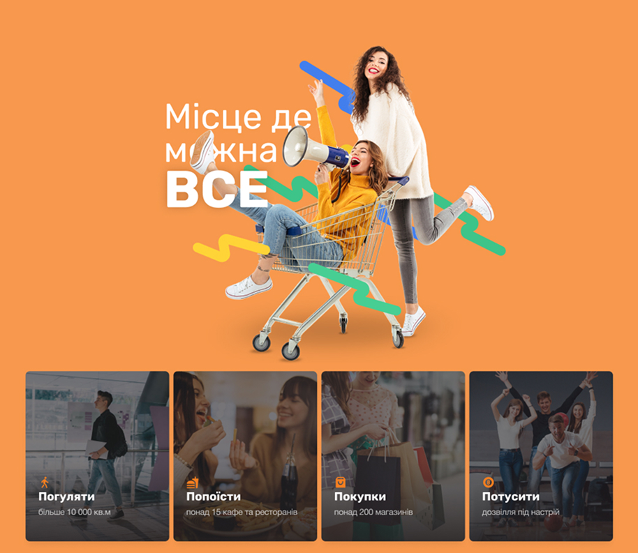
3. Design and development (Innovation): We created a minimalist, “calm” interface where the furniture itself takes center stage.
- Clean UI: We used large, high-quality photos, plenty of white space, and a restrained color palette that emphasizes the product’s natural materials.
- Subtle microinteractions: Smooth animations when loading pages, adding items to the cart, and navigating between photos create a sense of premium quality and comfort.
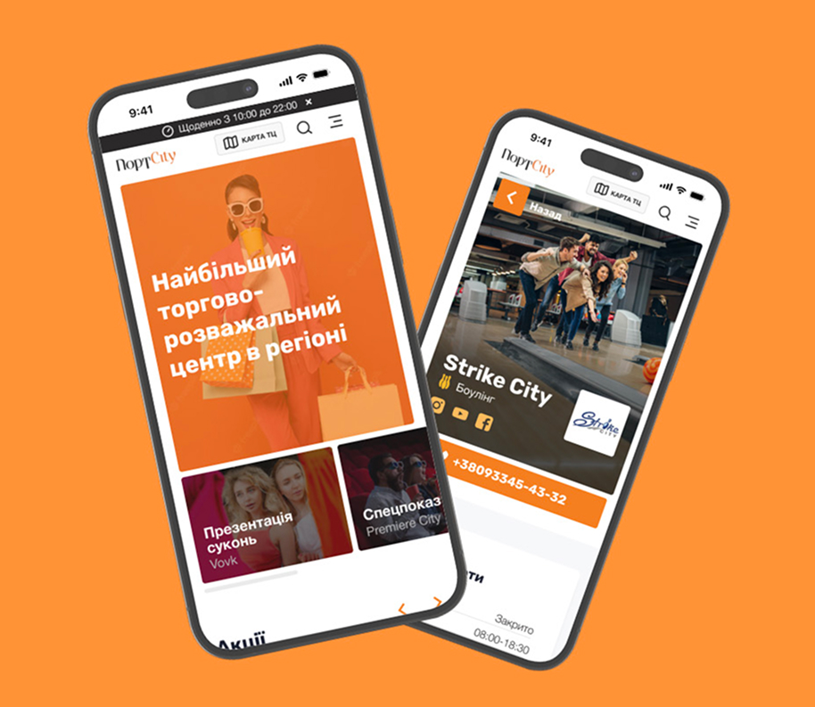
- Thoughtful purchase process: We completely redesigned the cart and checkout pages, making them as simple and transparent as possible.
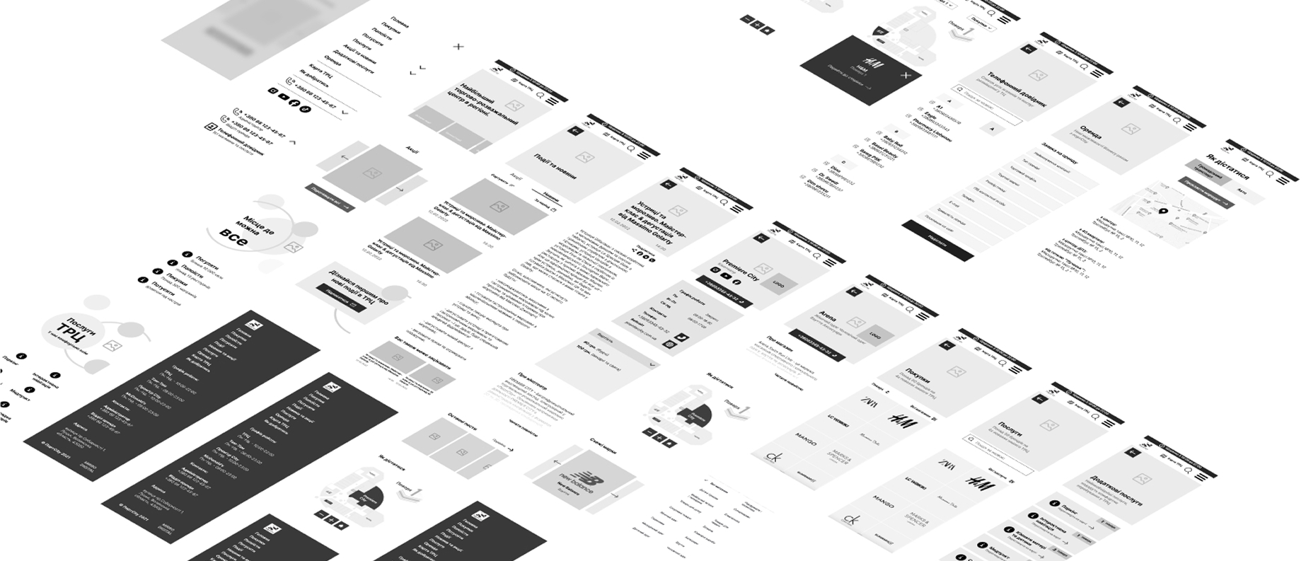
Wireframe process
KROMA is a brand with an excellent product and a strong philosophy of minimalism. Their previous website was visually appealing but did not fulfill the main business objective — it didn’t drive sales.
UI kit process
KROMA is a brand with an excellent product and a strong philosophy of minimalism. Their previous website was visually appealing but did not fulfill the main business objective — it didn’t drive sales.
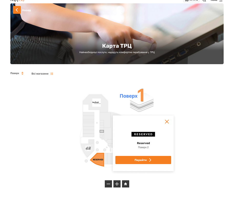
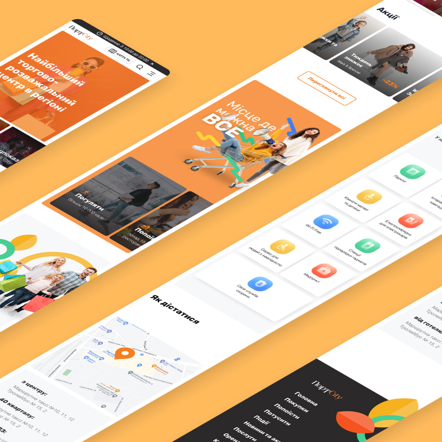
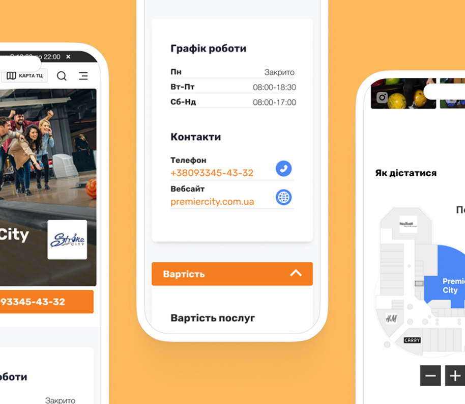
Responsive design process
KROMA is a brand with an excellent product and a strong philosophy of minimalism. Their previous website was visually appealing but did not fulfill the main business objective — it didn’t drive sales.
KROMA is a brand with an excellent product and a strong philosophy of minimalism. Their previous website was visually appealing but did not fulfill the main business objective — it didn’t drive sales.

Our approach was based on three key principles: expertise, meaningfulness, and innovation.

Viktor Bey

“The Akita team didn’t just complete the technical task. They deeply immersed themselves in our brand’s philosophy and were able to convey it in the digital space. The new website isn’t just beautiful — it works. It’s the best investment in our business in the past year.”
Do you have a similar challenge?
Let's discuss your project